GIF Practice

I had a session few Fridays ago at university where my tutor taught us how to create GIF images. I am familiar with the image file as I use it regularly on social media and even create myself some with my personal videos and a GIF maker online. But the tutor explained the making of GIF using still images which is quite different.

She quickly showed us her tutorial on making the GIF using Adobe Photoshop. I have done this once before and posted on this blog back to the beginning of the course (link to the post) where I did my own little animation just to get the idea of creating a GIF image.

We then had a shoot in the TV studio so we could take our own images to use to create a GIF image. We took turns in spinning ourselves infront of the camera. I didn’t get those images as I didn’t bring my own hard drive that day but I already decided that I would create one myself at home as I felt that the shoot was a little rushed.


I took the images of myself turning around with the white background and a shutter button to my SLR. I then moved on to editing the images. At first, I attempted to use Automate Batch effect where I use an Action (adjusting settings like brightness and colour balance, etc and save it as an Action so I can use it on multiple photos) but this wasn’t working and I struggled to get it solved. Instead, I had to waste my time editing the images each by each but with the same settings and levels.

sc1

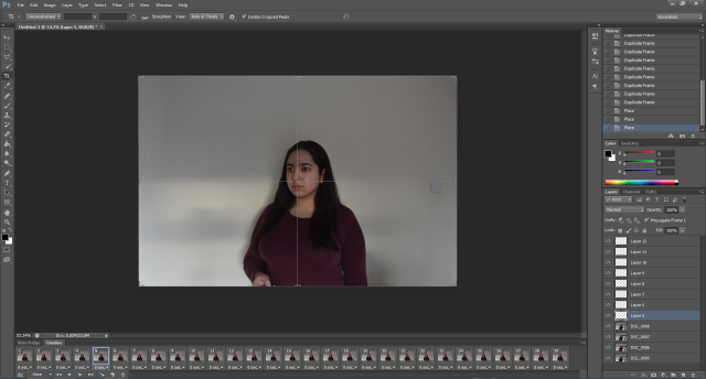
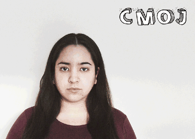
I set up the Frame Animation timeline and added layers so I could place the images onto. I arranged the images so they all fit together, as well as adding my initals in the top corner. I also cropped the image as you could see obvious movement like seeing me press the shutter remote.

sc2

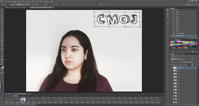
I warped the text so it would have movement during the animation. I used the font from dafont.com and adjusted it so the background would be transparent.

Overrall, I found this experience quite interesting as I learnt how to create the GIF using Photoshop and tried to learn to create an Action and use Automate Batch but failed due to software errors. But I definitely have learnt techniques from this experience and I feel that I would possibly do something like this again in the future.

If I was to do this again, I would obviously sort out the software errors to use Automate Batch, and consider the structure of the GIF image, like make a story for the animation so there is a meaning behind it. This would be challenging because I would need to come up with a super short story to put in the GIF since it is not like a video.

I saved the GIF for the Web since that’s the only way to view GIFs. I had to compress the GIF because not everyone has high speed internet to load the GIF so I saved it as a default in which is an average speed for most people – 28.8Kbps. Then I compressed it by reducing the Colours, from 256 to 64 as most people nowadays use a monitor that holds 64 colours. Even my monitor can handle 64 colours so it was best to use this setting.


GIF Results

CMOJ-GIF


TUTORIALS USED:

http://www.dummies.com/how-to/content/how-to-batch-process-actions-in-photoshop-cs6.html

http://www.instructables.com/id/How-to-make-a-gif-animation-using-pictures-for-you/

FONT: http://www.dafont.com/sketch-3d.font?text=CMOJ&psize=l&back=theme

Poster: Improvements

I had a session with the group and a tutor last week and it was the session that our tutor gave us feedback on our progress so we could find out anything that we needed to improve on. So I managed to get feedback on my poster works and they were definitely helpful as she was very specific in details on how to make my posters better.


POSTER DESIGN #1

RIII-Poster-1

She was immediately impressed with my first draft of the first poster, she commented that she liked the photo in the background and how I use materials onto the image, like the text and colours.

She explained the improvements for the poster:

  • Add the title of Richard III Visitor Centre at the top to make it clear where the poster is from.
  • If the title is added, remove the top text “Visit King Richard…” in the bottom black banner.
  • Edit the image by blurring and reducing contrast in the background to bring the statue out more.
  • Align the image as the top part of the crown is cut off at the top of the poster.

After learning about these improvements, I took my poster for second editing process. And the results have come out better, and I also changed the logo.

RIII-Poster-1 (2)

I also posted the new design on the Facebook group for more feedback from the group and tutors. They have commented that the design looks much better with the edited background and new texts.

I changed the logo to the golden version because I think it balances out the amount of gold colours in the poster with the black and white colours. Reducing the contrast and blurring the background of the image looks better because the statue stands out more and I think the audience would be able to see the statue more clear.


POSTER DESIGN #2

RIII-Poster-3

When I drafted up this poster, I was unsure about it because I felt that the poster looks bare. There were a lot of spaces and I wasn’t sure what else to add. Thanks to the feedback from the group, they suggested few things such as adding price lists.

When I showed this poster to the tutor, there were a lot of debate on how this design could be improved. She suggested:

  • Adding a price list would be useful and fill in the spaces.
  • Change the font on the bottom text as they look boring.
  • Align the icons and texts to look professional and not messy.

I adjusted those improvements and the results came out better.

RIII-Poster-3 (2)

I added the price list and change the font, I felt that the poster looks much better now that I have filled in spaces. Although, I still think that the previous poster design above looks much better as it is more dynamic and professional. But this poster is also a good idea to show an icon of the spear and a crown to represent King Richard III.


POSTER DESIGN #3

RIII-Poster-4

The poster is similar to the black version of the poster so I had similar suggestions for improvements, like changing font and adding price list.

RIII-Poster-4 (2)


So far, I think I have done well in designing posters and I enjoyed doing these. I felt that I have gained skills and knowledge in designing posters and I would do it again in the future, perhaps in a career.

My last step is to get these new posters checked by the group and tutors for any more suggestions and as a group, we can then decide on the final poster for printing and used in the presentation.

Posters: Second Draft

I wanted to try creating more posters with different styles. This time, I decided to challenge myself to take on graphic art and draw up my own posters, rather than using photographs.

RIII-Poster-3

Still using the same colour combination, I stuck with the golden shades and black and white. I thought that the results are fairly good but at the time I was designing it, I felt that the poster isn’t finished and I felt like it needed more. I felt that the poster was empty, probably because of the amount of space available; it needed filling in. So I turned to my team (via Facebook) for their opinions and suggestions:

  • Add prices list to fill in the space.
  • Change the font to make it more exciting.
  • Align the texts properly.
  • Improve the stencil art as it is not easily recognisable for everyone.
  • Create better text that’ll attract (e.g. The King of Car Park, The Lost King).

I agree with the suggestions above and will look in adding the prices list as the poster would be more informative and I think that some viewers would want to know the prices quickly to see if they would fit in their budget on day out events, rather than making an effort in logging in the official website to find the prices because they may not interest them. Also, I believe that changing the font would make it look better because I can see that the font I used for the bottom text look boring and doesn’t fit in the theme. I will be looking into finding different fonts that would have historic feel to it.


As the poster I designed above has black background, I decided to do the opposite in terms of colour.

RIII-Poster-4

The reason why I have created this light version of the poster previously is because it is more environmentally friendly in terms of colour printing as there is less black colours and it is more gentle on the eyes and clearer to see for some people. Also, I wanted to include more gold colours in to fit in the theme of the centre. But the suggestions for improvement is still similar to the previous poster:

  • Adding the price list.
  • Re-positioning of the text.
  • Changing the text font on the bottom.
  • Aligning shapes and icons.

Posters: First Draft

After looking at examples of museum posters, I decided to take some of them as inspiration and recreate them for Richard III Visitor Centre.

I have drafted up two posters so far, and I think I have done well. I never expected to have fairly good results out of first tries but I’m happy how I started on the posters.


Inspiration: The British Museum

6156_poster_iphone

I like the strong contrast of the image as a background and the colour combination to go with it. I think it looks very professional and creative at the same time.

So I decided to recreate the style of this poster for Richard III Centre. The image below are step-by-step to creating the poster. I took an image of the statue when I was on the field trip last year to Richard III Centre.

blog1

Firstly, I thought that the sky was plain and boring and I wanted a dramatic sky so I could play with contrast. I decided to search for free stock photo of a sky that I could replace with. [SOURCE: https://stocksnap.io/photo/V85UKOJEHQ]

After working out how to replace the sky and done it, it was time to play with settings. I focused on brightness/contrast and colour balance first before applying Black & White effect. I continued to adjust brightness and contrast further, and as soon as I was happy with the results, I had a bit of time to work out how to lay on the text and materials.

RIII-Poster-1

I collected the new logo draft from another member of my team, Alon, although I would have used the golden version of the logo, rather than black version so it would stand out more and balance the levels of the colour combination. I was unsure of what text to include and looked at RIII Centre’s current leaflet and used the same text.

I also took an icon of Facebook and Twitter and recoloured it so it would fit in the theme.

At the end, I was really pleased with the results, although there are few areas I could have done better:

  • Changing background because the building is irrelevant. – How to improve? Take a photo of the actual centre or use a landscape photo in Bosworth.
  • Come up with better text to attract the viewers. – How to improve? Find a fun fact about Richard III that would appeal to viewers.
  • Change the logo. – How to improve? Ask the logo designer for the golden version.


Inspiration: Natural History Museum

img_1187

I like this poster because the image of the man is drawing my attention, it is like he is looking at me for attention and question me with the text included. The text is also quite simple but appealing. Also, I like the gentle colours so it is not harsh on the eyes and the colour combines well.

blog2

I also took this photo on the field trip and I thought it looked good for a poster. I started off by adjusting settings, such as brightness, contrast, colour balance and curves. I inserted the tinted effect, and added new layers with Gradient Maps before reducing opacity. I thought it looked gentle enough but have historic feeling to it.

RIII-Poster-2

The results from creating this poster is quite good in my opinion, but not as great as my first draft. I think the poster colours are fitting and simple but I’m worried that the poster may be too brown/cream coloured and need more balance with different colours. Also, I am in between whether the font is professional or boring, and I think it depends on individual’s opinions. Although, I like the ‘Book Now’ icon as it draws my attention and it stands out well.

Few areas that could be improved:

  • Adjust the colouring – It may be too much of sepia effect and perhaps use coloured image instead.
  • Change font – the current font may be boring, so changing font may look more dynamic.


Creating Titles

We needed some title art for the mock websites and social media, so this was my job to get the titles done and set up on the website.

Using the same font and layout from the title animation, I created simple titles; black background with white font. I briefly saw the mock website the other day and the background was also black-ish, except it played the video we created in the background so it would make sense that the background of the title to be black so it fits in the theme of the website.

Derry Shilletto Still Title

I used Photoshop to create these titles. Although, they do look too simple but I need to discuss with my team for their feedback on my art and possibly talk about any new changes, perhaps more work on the titles using graphic art tools that I have.

Photoshop – Derry’s Interview

As we had a filming session last Thursday, I was the photographer in this session and it was my responsibility that I edit the selected photos for any corrections; brightness, contrast, colour balance, vibrance, etc.

Using Quick Mask

Using Quick Mask

So far, I’ve edited three photos and at the beginning I was already struggling because I wasn’t sure on how to edit these photos, like what should the results look like? Should there be any particular effects or just simple corrections?
So, I went for simple corrections and look for second opinions from my team.

Difference between vibrance/saturation in background.

Difference between vibrance/saturation in background.

Difference between vibrance/saturation in background.

Difference between vibrance/saturation in background.

I was mainly using Quick Mask to adjust settings in the foreground and background; blurring the background to make foreground stand out. Increasing the vibrance to soften the colours and still stand out, and sharpening it so that the foreground is quite strongly standing out. Overall, I adjusted the settings of brightness so the photo doesn’t look so dull, and increased contrast a little but not too strong.


BEFORE & AFTER

beforeafter1

beforeafter2

beforeafter3